Projects
My recent work
Redesigning Database Software at EPATT
I started volunteering at EPATT as a tutor but when the staff learned about my experience in UX design they asked me to redesign their database software which was rife with UX issues. So I led an ad-hoc team to investigate the core problems with the existing design in order to suggest systemic solutions to the issues faced by their proprietary software. This project is ongoing.
categoryAbout the project
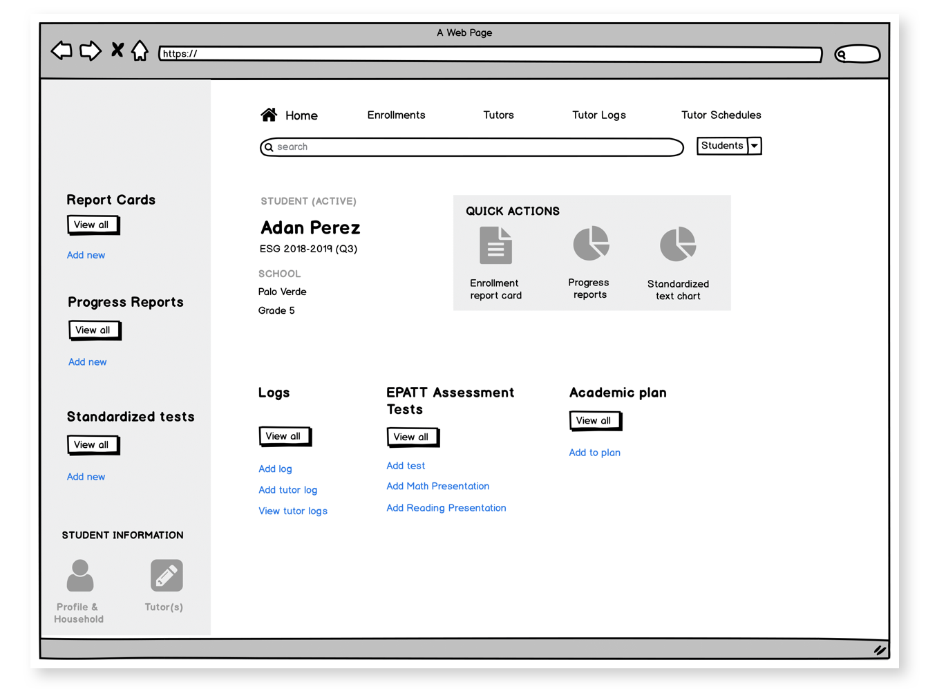
East Palo Alto Tennis & Tutoring (EPATT) is an after-school program at Stanford University that provides holistic education for students in low-income families of EPA. I did a perfunctory review of the software, conducted contextual interviews with the staff at EPATT, performed affinity mapping, surveyed the staff to get quantitative data on usage, and, most recently, created low-fidelity prototypes to test possible solutions with the staff.
peopleTeam & role
The team consisted of myself as the UX designer and Kesha Weekes (academic director) as EPATT staff advisor. We had (near) weekly meetings to review progress, sanity check the direction of the design, coordinate with the rest of the staff and make plans for next steps.
The Problem
EPATT contracted a team in SF to develop database software that the staff now uses to maintain all student, parent and tutor related records. This includes student personal information, grades & report cards, schedules, and other information related to their academic growth.
Unfortunately, not much effort had been invested in the user experience of the software. It proved very difficult for the staff to use and they've mostly had to work around the design flaws, inventing paths on their own. The platform had systemic problems that seemed to require either an abundance of small fixes or a few structural changes based on thorough research and analysis. These have been our goals for the product redesign:
Unfortunately, not much effort had been invested in the user experience of the software. It proved very difficult for the staff to use and they've mostly had to work around the design flaws, inventing paths on their own. The platform had systemic problems that seemed to require either an abundance of small fixes or a few structural changes based on thorough research and analysis. These have been our goals for the product redesign:
- Investigate the UX issues of the platform
- Group the problems identified during contextual interviews using an affinity map and interpret the results to find elegant solutions to overarching problems
- Test solutions with the staff and iterate
- Send mockups to the development team for implementation
Contextual Interviews - Master Apprentice Model
I scheduled and carried out 30-minute contextual interviews with 9 members of the EPATT staff to try to understand how they interact with the database software. Since I had almost no experience using this software (and also since it's a good UX methodology) I performed a master-apprentice model of interviewing where I sat with each staff member and spent the session observing and asking exploratory questions about their usage. My main goals for the interviews were to:
- Discover the typical pathways the users take and why they take them
- Main frustrations and obstacles in achieving task goals
- UX components that work and those that don't
- Minor UX bugs
Here are some of the questions I asked the staff during interviews:
- Can you walk me through a few examples of tasks you perform when using the software on a typical day?
- What's the most difficult part about using this?
- If you had the power to change anything about this part of the software to suit your needs, what would you do to improve it?
UX in the EPATT Workplace
During the project, while working closely with Kesha, I impressed on her the empathy involved in user experience. I showed her that paying close attention the moods or emotions of a user while they encounter a problem is key in determining the right approach to take to a solution. Since the UX project has begun, I've stressed the importance of UX to other members of the staff as well to build a deeper appreciation of the process within EPATT. With this new perspective the staff has begun to observe their issues with the software through that informed lends. Since the software is also used by tutors and parents, the staff now has a better understanding of how best to consider the interaction of those segments of the userbase as well.
Affinity Mapping
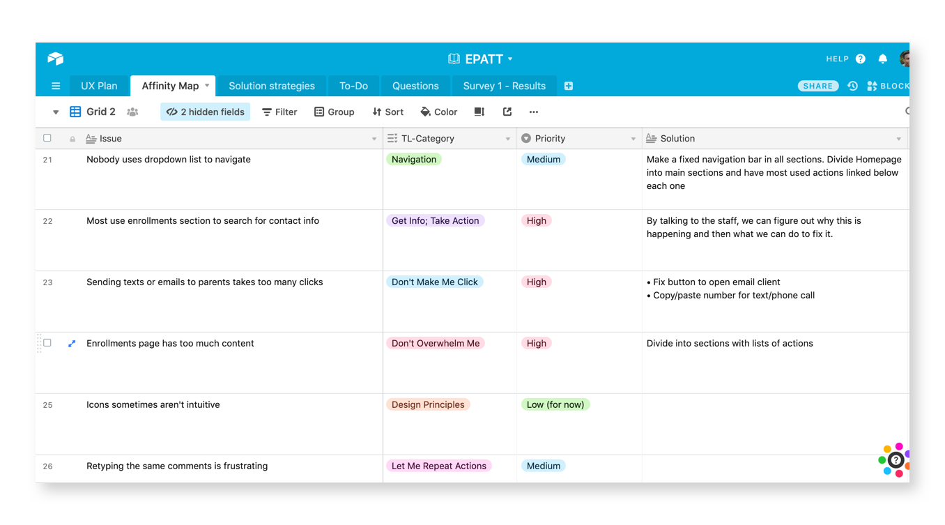
After going through my detailed notes on the way each staff member experiences the database software, I organized what I learned in an affinity map. I was able to categorize the problems into groups:
- Don't make me click
- Don't overwhelm me
- Get information; take action
- Navigation
- Sorting results
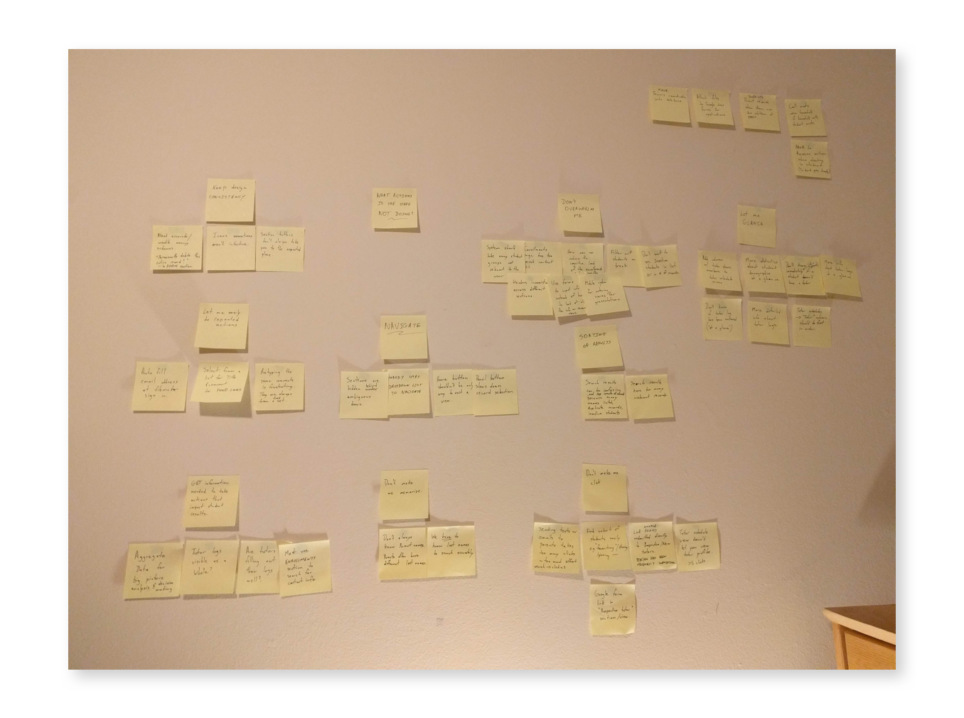
Then I used Airtable to share these problems with Kesha and the rest of the staff. This made it easier to collaborate to find potential solutions and to determine the priority of each problem – something that I needed staff opinion to figure out since I lacked the domain experience necessary. Kesha was able to quickly determine what should be done now and what could be shelved for later. I produced a deliverable listing high-priority problems and solutions that she then shared with staff for their feedback. This involvement gave the staff a stronger sense of ownership over the UX, and they later reported that this improved their understanding of questions in the future.
Staff Surveys
After brainstorming potential solutions with the staff, I realized two things. First, there were several gaps in my knowledge of what was quantitatively important to the staff. Second, new questions were born from the affinity mapping such as "Why are so many staff members neglecting the search feature in certain scenarios but using it in others?" To answer these, I decided to survey the staff with a Google form to carry out more research to inform our judgement of what the first prototype should be.
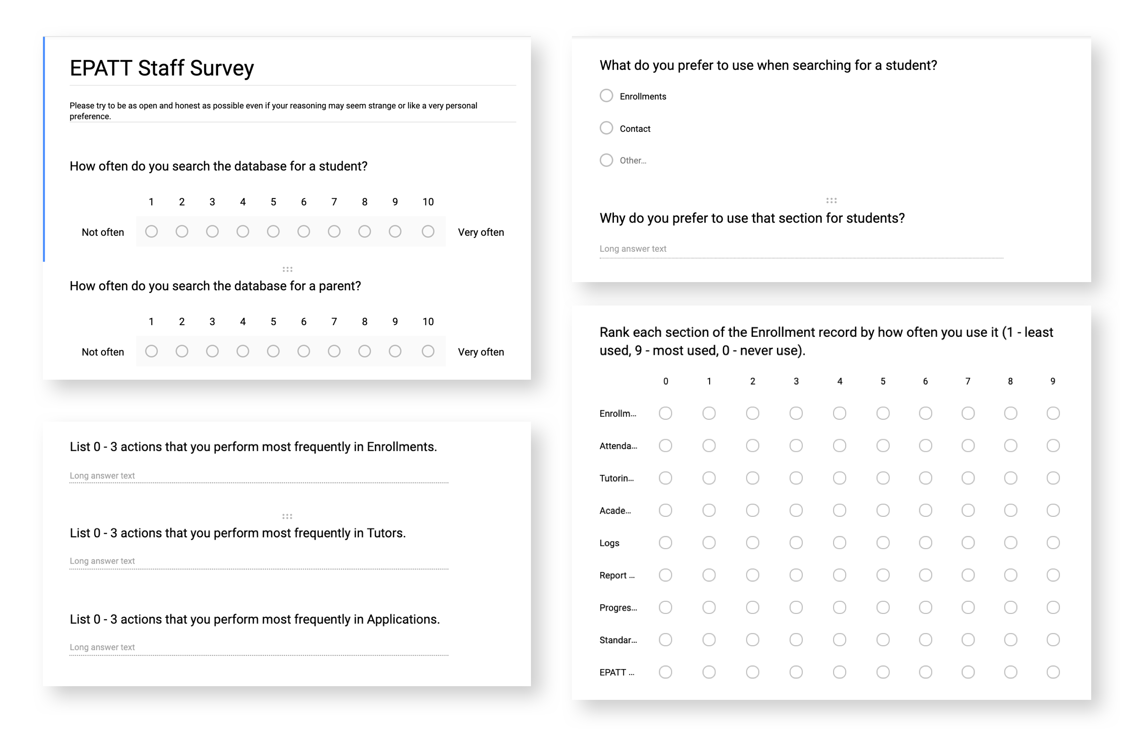
At one point I wanted to learn about what parts of the current homepage and Enrollment record did the staff find most relevant to their daily tasks. To figure this out I mimicked Card Sorting by using a ranking matrix in Google forms.
Design Insights
Using the data I gathered from the contextual interviews, affinity mapping and the survey, I discovered the following design insights:
What we learned
Design insights
The staff gets confused by poorly labelled icons/sections and an inconsistent naming scheme
→
Gestalt principles and a few design heuristics weren't met by the system and this was slowing the staff down because they'd either have to guess or memorize what action to take
In key sections of the software the staff spent too much time sifting through a lot of unnecessary information to get to what they want
→
Showing users everything at once and a lack of robust search features built a cognitive load which must be reduced
The staff does not readily have the information they need to swiftly make important decisions
→
There is an opportunity to provide relevant metrics about student records
The staff spends a lot of time typing out the same type of information every day
→
The system lacks methods for the staff to perform repeated actions/input
the search system is never used by the staff and they instead scroll through a list of records to find they one they want
→
the search system is clunky and unreliable and therefore the staff defaults to a pathway with a limited number of steps. For the staff it's better to know how many routine steps it's going to take (even if it's many) than to search not knowing if a result/record will be found in the next minute
The staff feel that the various sections of the software were siloed and the staff invented ways to work around having to leave where they are in the software at any given time
→
Having a home screen as the only terminal for navigation adds an extra step to everyone's workflow and reduces the sense of freedom of motion
Low-fidelity prototypes
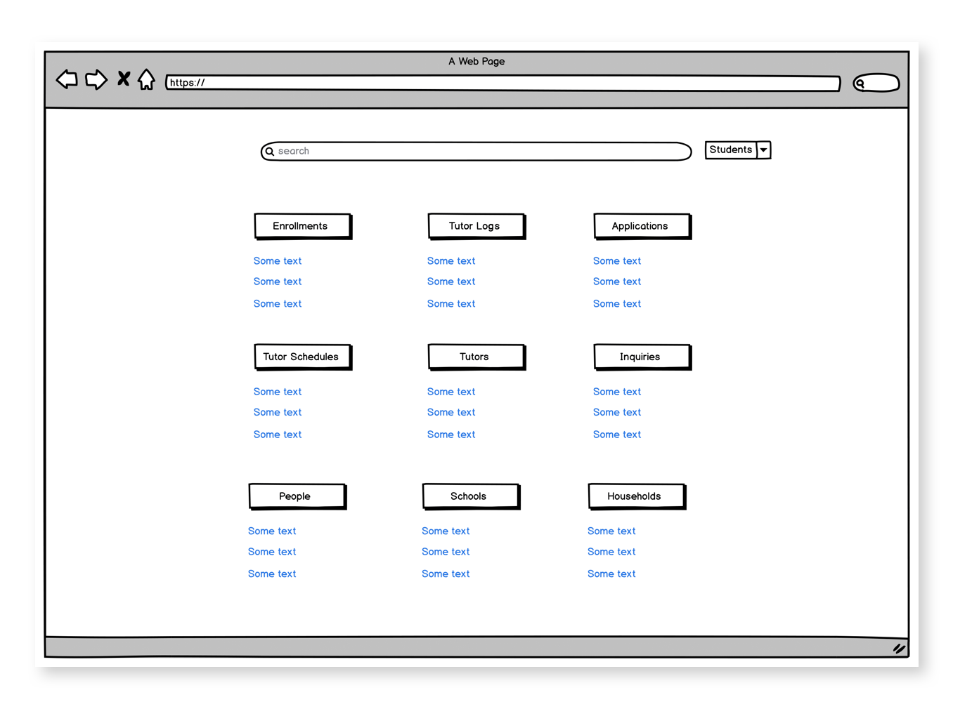
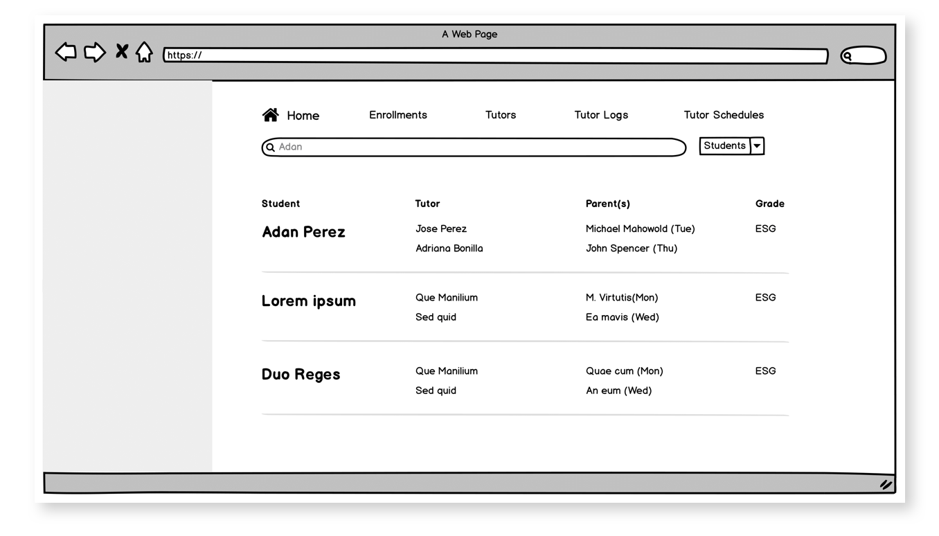
Most of the problems we identified were summarized in a report with advised solutions that could be performed immediately by our developers. For the problems that required new and complex UX direction, I decided to mockup low-fidelity prototypes to test with the staff, iterate, then evolve to medium-fidelity prototypes for more testing before passing on a deliverable to the developers. We decided to focus on improving the design of the home screen, search results and individual student records with a focus on navigation, reducing cognitive load and efficacy.

Next steps
- User testing low-fidelity prototypes with the staff then iterating
- Creating medium-fidelity mockups
- Testing medium-fidelity mockups with the staff then iterating
- Delivering tested mockups to developers for implementation
Other projects

